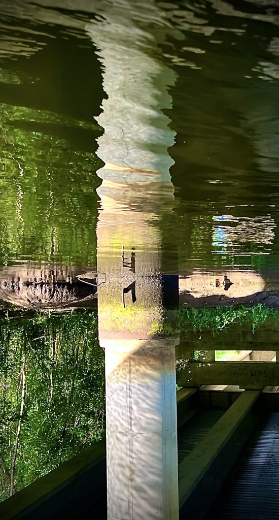
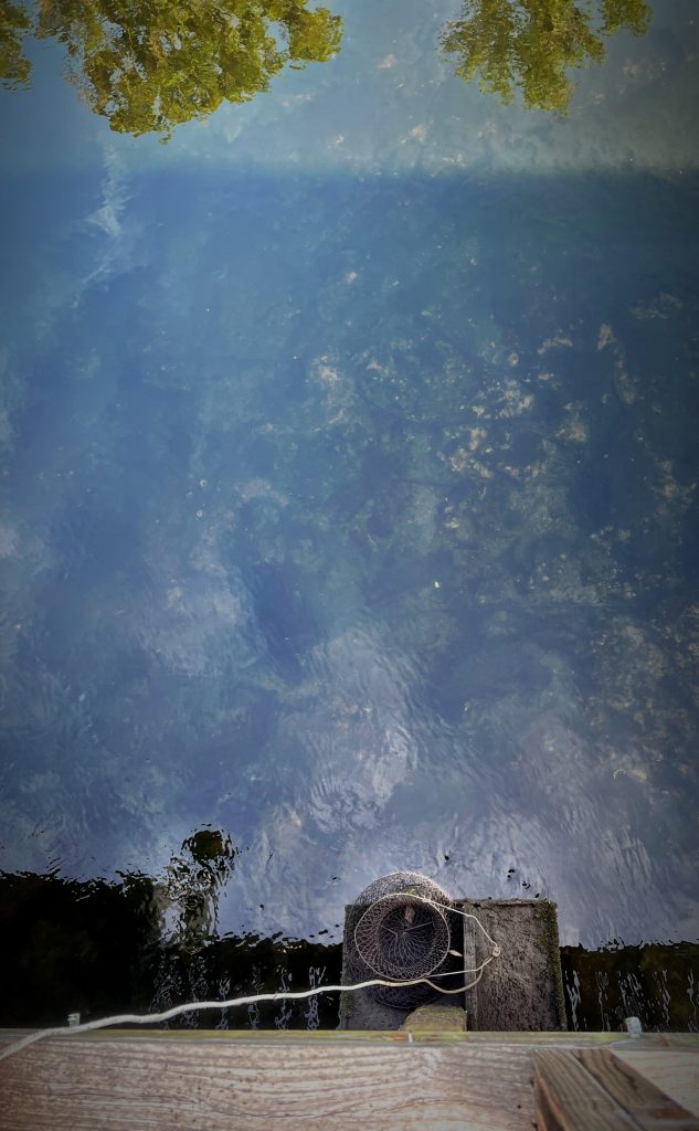
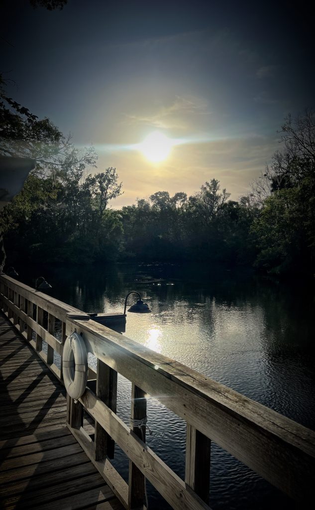
Last week was my wife’s and daughter’s Spring Breaks, so we drove with the dogs down to the Florida Panhandle, where we stayed in an especially crooked fishing shack hanging over the Aucilla River. From there, it was an easy paddle down to the Gulf of Mexico, complete with old-man’s-beard, leaping mullet, and easily spooked alligators.
I’ve been experimenting with using white gel pen to add brighter highlights. These shiny eyes in the dark put my son in the mind of Gollum from The Hobbit.
Context: Last week I attended ICFA—who are nice enough to invite me every year to read a story, comp me a couple meals, and otherwise leave me alone to mooch appetizers and wine from various receptions and schmooze with academic folks I’ve never met before and editors I know. On Saturday I attended a panel that featured Nancy Hightower, whose photography work largely focuses on capturing NYC cityscapes in puddles. Her work is absolutely stunning. Earlier that morning I’d gone to see a panel where Ann Leckie was being interviewed about her upcoming novel Radiant Star. Leckie mentioned, in passing, that she’d gotten some inadvertent writing advice while attending a beading class years ago, to the effect of “if you are looking for a structure and don’t have one, repetition always works.”
So that was what was in my head Saturday morning, when I looked at Hightower’s uncanny, liminal photographs of the exceptionally mundane airport conference hotel we’d all been living in for four days:
Mirrors are repetition machines; repetition is the fundamental rudiment of structure; structure is the lone difference between “art” and “a neat thing I saw”
… and then I was alone in my room with this shiny post-modern coffee table, and I had my phone in my hand, because I always have my phone in my hand, because we all always have our phones in our hands, and taking a picture is a helluva lot better for my mind than looking at the news one more time.
My wife and kids all preferred the first of these two sketches, while I felt the second was clearly better. This isn’t the first time we’ve disagreed about sketches, but it was the first time that none of us could intelligibly articulate why we were so certain of our position. Each just felt that it was totally self-evident which sketch was better, and trying to defend that was like trying to defend why blue is blue.
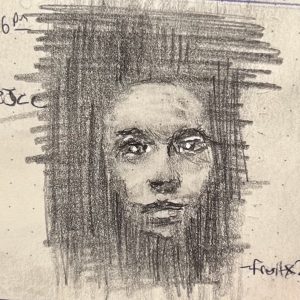
Matters of taste aside, a couple things became clear this week (which was, like last week, entirely dedicated to working with the new-to-me technique of laying down a light layer of graphite to start, so that I can draw in dark values with my pencil and “draw” in light values and highlights with my eraser):
Work in this way makes it much easier to drape cloth in a naturalistic way
Backs are hard for the same reason noses are hard: they are nominal regions defined by how we categorizing things in our head, not starkly delimited regions defined by hard lines (contrast: the eye, a beard, a profile, etc.) I.e., backs are another prime candidate for “draw with the eraser” approaches.
It is intensely satisfying to start a drawing break by just laying in a nice smooth medium layer of graphite. Recommended.
I’ve been drawing for the last month, just not posting, because I’ve been really busy, and not really happy with many of my sketches.
In the middle of last week it dawned on me that instead of just layering up graphite on blank paper, I could start a sketch by laying down a more-or-less uniform mid-tone of graphite over the entire area. Then I’d be able to draw in darker darks in the shadows, and draw in brighter highlights with the eraser. 💡🤦♀️ (I am besought by extremely obvious revelations. Ask me how old I was when I first realized that the “Little piggie that went to market” wasn’t, like, wandering the aisles of a grocery store pushing a cart.)
Anyway, the end result are sketches with a dynamic range of tonal values I’m much happier with, where I work faster and find the work much more soothing overall.
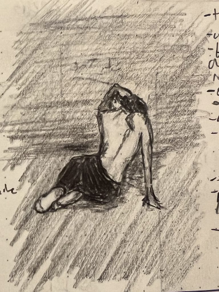
My son’s pick for the week was the bottom sketch. He liked the lips.
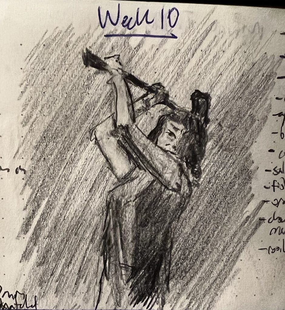
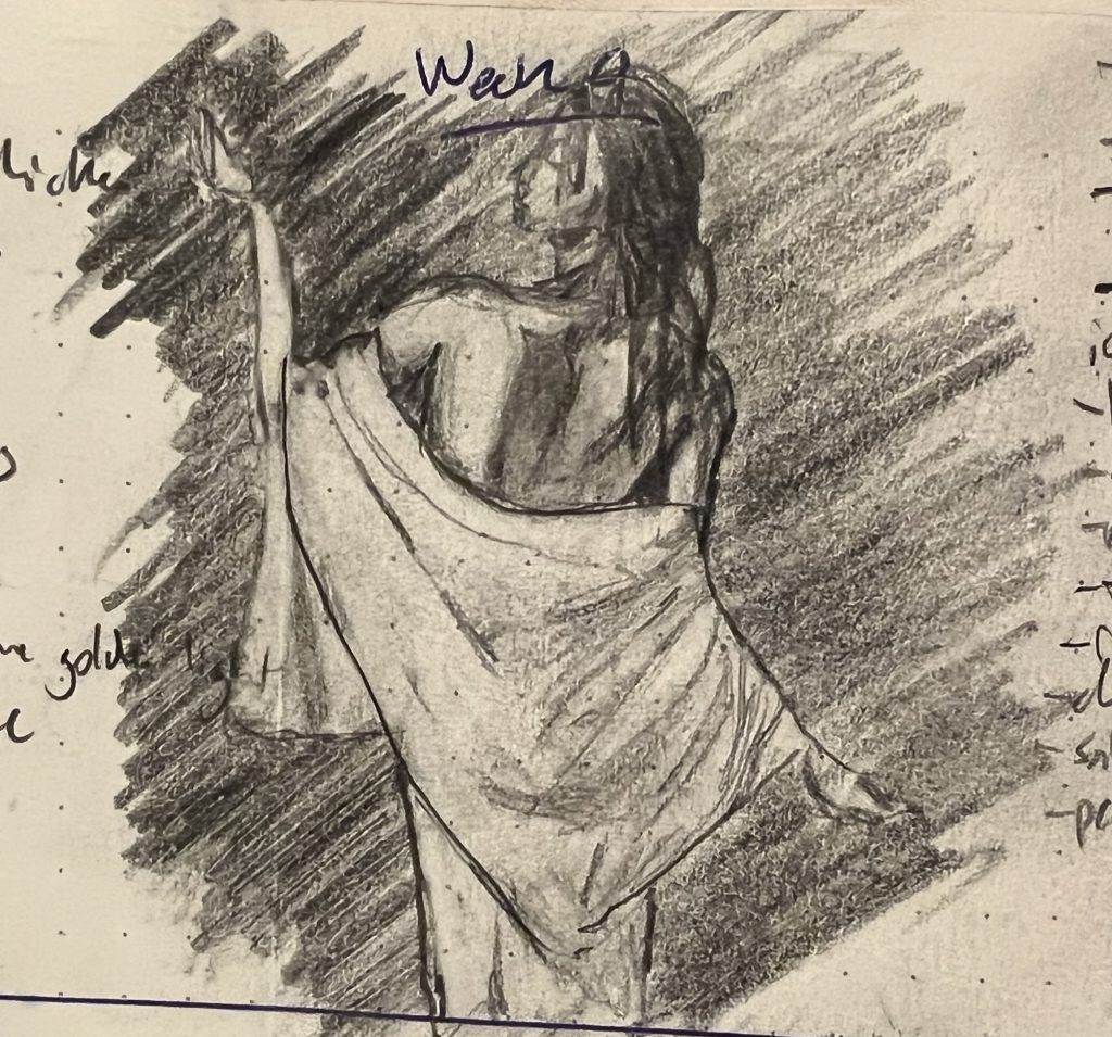
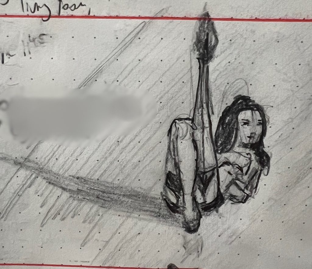
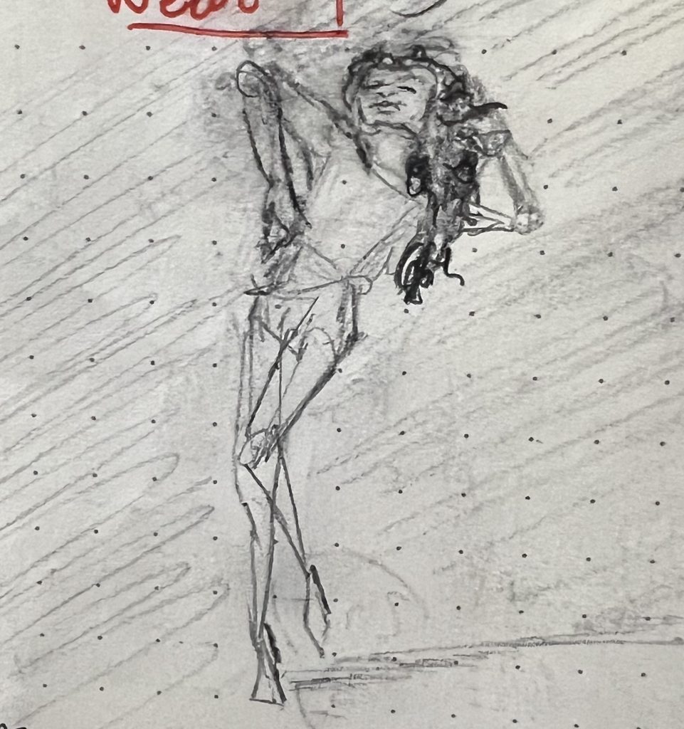
Week 4 for is pinups again—where less is more, both in terms of clothes on bodies and lines on page.
My son said this first one was the most “human and dynamic.” I picked it because it was the most arresting: I was fairly confident you’d stop and look and click. At the very least, it epitomizes something that feels really central to the pinup aesthetic, about the power and confidence of the women depicted in these pieces. They may be nude, but are not naked.
That said, I think I was probably happiest with this sketch, which was maybe the most “poetic” for lack of a better word. It captures something about being lost in the luxuriance of moving through space that I really liked.
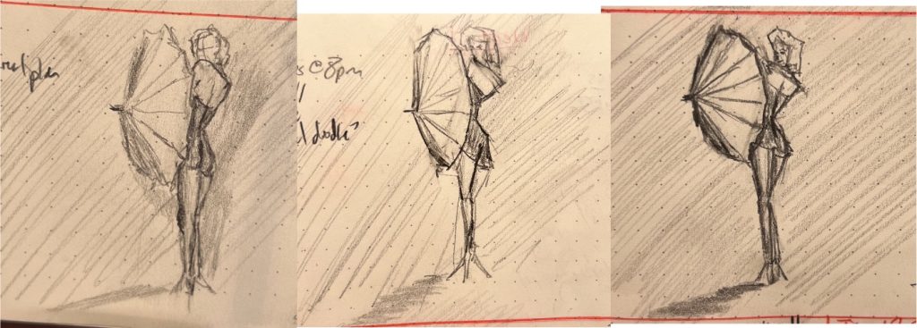
It dawned on my last week that there is an interesting geometric regularity among images that you glance at and immediately categorize as “pinups.” More often than not, the women can be quickly visually approximated with a handful of mostly acute triangles, like so:
These are presented in the order I drew them over several days—the reference was an old Marilyn Monroe pinup I found on Pinterest. My son thought the one furthest to the left was the best one, because it really properly capture that coolly appraising over-the-shoulder glance (even with no eyes). I feel like I was still making her torso waaaaaay too long (a chronic problem I have sketching full-body gestures). The sketch furthest to the right is the best overall, even if it’s the least like the reference. I included the middle because, despite its flaws, it captured the “geometricness” of the pose that had caught my attention to begin with.